As explained in my previous post, I’m working on the Next Generation of the NIH Sailing Association (NIHSA) website. Here are my initial 2.0 wireframes for the majority of the layouts.
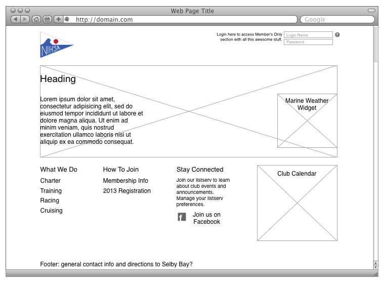
First, we have the homepage. I think a layout something like this will flow nicely into a good, useable design. Members have quick access to the login in the upper right, while three main categories of information and further links will be prominent in the middle of the page. Other often-used info such as weather and events will live right on the homepage.

One caveat with this design: as far as I can tell, there is no marine weather widget for any CMS because marine weather reports are not provided as part of the National Weather Service’s API. I am not sure it is feasible for me to make this happen (even though it would be awesome) with my level of PHP (will be using Wordpress), although right now I’m excited to try.
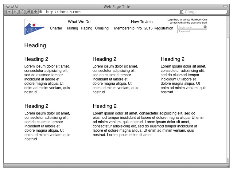
Next, the Member’s-Only section. There are just a few resources in this section so they will be linked to “app-style,” as I like to call it: big, bold button/sections for easy reference.

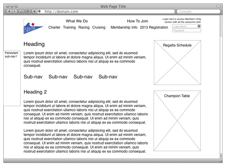
Finally, the wireframe for the rest of the informational non-Members pages. I’m not happy with this structure yet, but I’m going to start here and see where it leads. I believe all the parts are there but the design is does not flow as I’d like. I’m also not sure yet about the best way to treat the sub-sections within each page. The NIHSA membership has a large part that is not computer-savvy. I’m not sure if a persistant sub-nav floating on the left of the page will help or hinder this group. More research!

