The United States Extractive Industries Transparency Initiative (USEITI) was part of an international effort to promote open and accountable management of natural resources. For over two years, I led an agile, iterative effort to create a site that provides data about how the U.S. manages extractive industries in a user-centric way.
The Extractive Industries Transparency Initiative (EITI) is a global standard that promotes open and accountable management of natural resources. In 2011, the U.S. committed to join EITI as part of Open Government Partnership. But what would the U.S. version of EITI look like? The U.S. Department of the Interior, who was responsible for leading the charge, wanted to make sure USEITI was meaningful to U.S. citizens.
I joined the project in 2013 as a Presidential Innovation Fellow at the Office of Natural Resources Revenue. Before the U.S. joined EITI, the outputs of most EITI processes were “EITI Reports”: thick, printed tables of numbers that showed how much companies paid to extract public resources, and how much the government received. (In this way, the process hoped to combat any ‘disappearing’ cash in the middle, and make sure public resources made it to public goods such as roads, schools and hospitals.)
However, rather than printing yet another heavy document, the U.S. aspired to meet U.S. citizens where more and more of them expect to engage with information and services: online.
But first, we had to convince the broader group of stakeholders involved in USEITI that moving to a mostly online format would be a net win for both their individual interests and the interests.
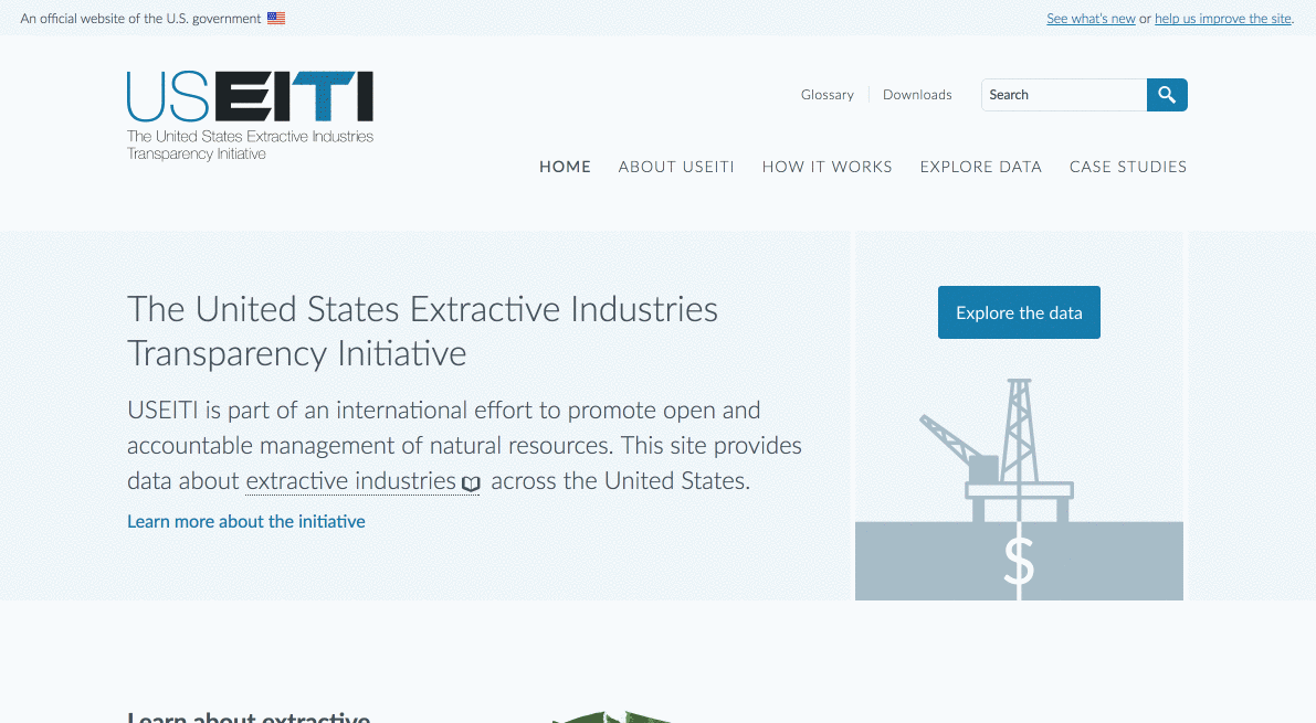
tl;dr: Check out this Internet Archive link to what the site looked like when it launched.
Prototype
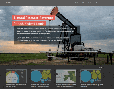
The first step towards our goal of eventual consensus around an online ‘USEITI Report’ was many meetings, and many prototypes to show what could be possible. This was a very early prototype showing a story-module-based interaction:
Design studio
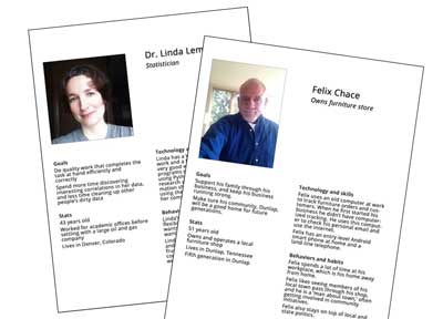
Part of signing on to EITI means that a country must engage a “multi-stakeholder group” of industry, civil society, and government to work together towards any outputs. In the U.S., this group included academics, large and small natural resource extraction companies, Tribal representatives, and many levels of government. This large and diverse group of people must agree that the path USEITI in on will get it to its goals.
A great method for getting a group of people on the same page, and coming up with ideas for (and consensus on) next steps, is the design studio. So, fairly early in our process, we held a design studio with the goal of solidifying project personas; choosing an initial focus persona; and designing one potential interaction for a future site. Several representatives from each stakeholder sector participated, and we left the studio with a path forward towards a beta site. Read an 18F blog post on the design studio.
Beta site
Even after the design studio, however, we still had a few challenges. One, not everyone involved in the USEITI effort believed that a website would be a better way to share information on natural resources. And two, since this sort of website hadn’t been done before, and was planned to be so highly interactive, our development and design team wanted something more than paper prototypes to test with users that resembled our personas so we could validate and adjust our project hypotheses and assumptions.
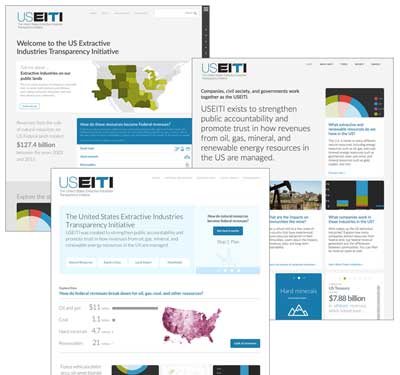
So naturally, we just built it! Rapid prototyping, and just getting something live for people to give feedback on is hands-down the best way to move forward. Our first beta site launched in December 2014 and featured a long-scroll homepage with various ‘stops’ with fairly complex interactions as you explored downward through the story of natural resources in the U.S.
Ooo, we like the beta, now here’s 100 other things
The beta site did its job perfectly: it got stakeholders excited about the possibilities made possible by moving to an online, interactive medium instead of a printed document. It also allowed our team to test the site more easily with Real People (tm).
We learned many, many things over the next months, including that once you show a group of dedicated people what data on a website might do, you might get a lot more of it! Much of the winter, spring and summer after the beta site launch was spent working with the multi-stakeholder group to ensure that they fully understood the needs and scope of our team, and the needs and scope of our learnings from user research. Conversely, the multi-stakeholder group wanted to make sure we understood their concerns around meeting international EITI validation requirements, and individual participant concerns around USEITI hoped-for outcomes. It was an exciting ride, and my team became part of a larger whole that consisted of the team at the Department of the Interior; the Deloitte team working on the accounting, narrative content, and international validation parts of USEITI; and CBI, an independent facilitation group that kept the multi-stakeholder group running smoothly towards project objectives.
You can read the project hypotheses we developed and iterated over time on the project’s GitHub repo wiki.
Usability testing
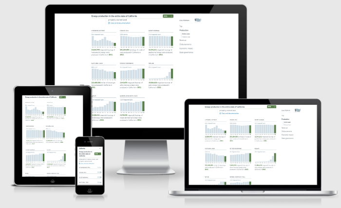
Once the multi-stakeholder group was (relatively!) on board with continuing towards a web-based USEITI output, I was able to move out of a prototype-beta-style team (where we were lean and mean, and I did my usual jack-of-all-trades work of design, code and UX) into a more mature team that included specialists for visual design, online interactions, and content design. I transitioned into a UX/PM role, and was able to conduct more structured and frequent usability testing as we moved to official Version One launch.
We started with paper printouts for hallway testing, and moved to live InVision shares (InVision lets you upload flat mockups and ‘fake’ interactivity and clicks to give the illusion of interaction, and is extremely helpful for testing before a site is fully baked!) and then finally testing on live development versions of our site. Here’s one of our research plans and its results.
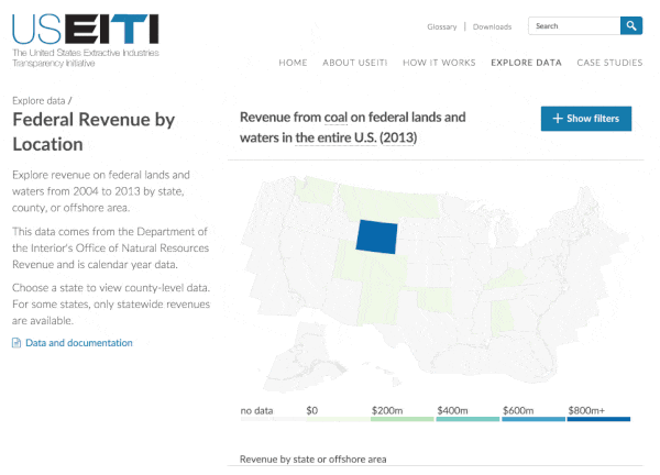
First official version one release
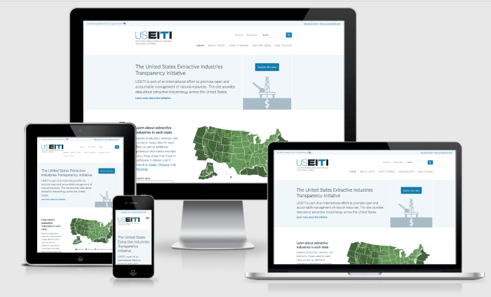
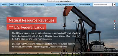
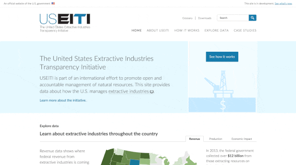
And finally, after many sprints and focusing of priorities, we officially launched Version One of the first-ever USEITI Report :D We are the first EITI country to offer an example of what an online, open-data-based report that is responsive to end-user needs might look like. How cool!
And we’re exited to keep moving! We’re looking forward to even more user research and usability testing in the upcoming months to help inform how the site is developed in the future. In fact, this site release placed deliberate emphasis on learning, with its biggest call-to-actions around providing feedback (and hopefully volunteering to talk with our team’s researchers!) Read about some of the new data we released, and why that’s actually super interesting!
January 2017 update: version two is up and running
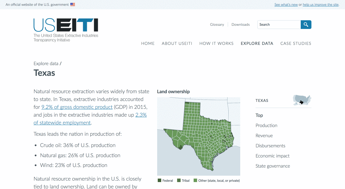
We continued iterating and improving the site based on user research and usability testing. One of the biggest changes was around how data is structured on the site: we made state and national profile pages. In our research, users looked for information about their state and expressed interest in seeing data about their area across multiple datasets. New regional profile pages provide a more complete picture of extractive industries at the national and subnational levels. To see how this works, explore:
- The national profile page
- State profiles like Texas, Utah, or California
- Offshore areas, like the Gulf of Mexico or offshore Alaska areas
State profile pages
Version two homepage