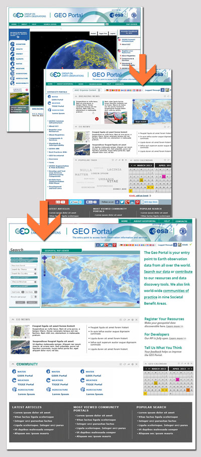
The Group on Earth Observations (GEO) is a voluntary partnership of governments and international organizations that is coordinating efforts to build a Global Earth Observation System of Systems, or GEOSS. Access to GEOSS resources is through the GEO Portal and I provided heuristic evaluation and information architecture analysis of its future design.
The design and development team for the next Group on Earth Observations (GEO) Portal is based in Europe. I provided written analysis of their proposed new system and a mockup that worked within the constraints of previous design decisions. My advice was incorporated into the next version of their design.
The goal of the new design was to make the GEO Portal easy to use for a non-specialist. To analyze the usability of the provided design, I developed personas for the GEO customer: first, Bob, a scientist who needs quick access to data, but is not a GEO specialist; second, Jane, a data provider who needs to be able to easily register data in GEOSS; and finally, Ellen, a developer who wants to build on top of the available information.
Bob will be the main user of the Portal page, as it is meant to be a data access point. With this in mind, in the new information architecture and design all information flows to three areas: data, news and community. All other links and tasks have been removed to other pages, and the upper left corner (where English-language site scanning beings) holds the search-and-map function that Bob will need. All “behind the scenes” GEO-as-an-organization information was not necessary here and was removed. I also collapsed similar navigation items that were previously spread throughout the page into single locations to simplify wayfinding.
Also important is the new area for purpose text on the upper right. Too many sites forget to tell the new user what their purpose is. It contains several calls to action that should be refined based on further usability testing.
Finally, the other two user personas (Jane, the data provider, and Ellen, the developer) have large links on the page calling them to the areas that will target them specifically. There is also a large feedback link in this area to encourage the user feedback process to improve the site over time and address pain points. This of course should not be the only method of user research, but it is a good start for a site that was not used to designing for the non-specialist user.

Visit the site (as of this posting, the new site design is not live)
